|
ГЛАВНАЯ
> Вернуться к содержанию
Modern Education
Правильная ссылка на статью:
Kiryanov D.A.
Formation of Requirements for University Website Interfaces Based on Accessibility and Usability Standards
// Современное образование.
2023. № 2.
С. 44-59.
DOI: 10.7256/2454-0676.2023.1.37503 EDN: RBELWG URL: https://nbpublish.com/library_read_article.php?id=69836
Formation of Requirements for University Website Interfaces Based on Accessibility and Usability Standards /
Формирование требований к интерфейсу сайтов ВУЗов исходя из стандартов доступности и удобства использования
Кирьянов Денис Александрович
ORCID: 0000-0001-8502-8333
магистр, Балтийский государственный технический университет ВОЕНМЕХ имени Д. Ф. Устинова
190005, Россия, г. Санкт-Петербург, ул. 1-Я красноармейская, 1
Kiryanov Denis Aleksandrovich
Master's Degree, Department of Information Systems and Software Engineering, Baltic State Technical University "Voenmeh" anmed after D. F. Ustinov
190005, Russia, Saint Petersburg, 1st Krasnoarmeyskaya str., 1

|
dennis.kiryanov@gmail.com
|
|
 |
Другие публикации этого автора
|
|
|
DOI: 10.7256/2454-0676.2023.1.37503
EDN: RBELWG
Дата направления статьи в редакцию:
11-02-2022
Дата публикации:
27-02-2024
Аннотация:
Предметом исследования являются методы построения пользовательского интерфейса сайтов ВУЗов, исходя из целевого назначения, потребностей пользовательской аудитории и ограничений пользователей, включая сенсорно-моторные и когнитивно-психологические ограничения. В качестве отправной точки для исследования целевой аудитории и следования стандартам доступности проводится анализ восьми сайтов университетов, на основе данных из открытых источников. Рассматриваются основные нарушения, которые препятствуют в различной степени пользоваться сайтом ВУЗа, а также наиболее известные и часто применяемые в дизайне и проектировании интерфейсов подходы, которые позволяют делать интерфейсы более удобными, не перегружая кратковременную память пользователя и не вызывая преждевременного утомления. В результате исследования формируются основные требования к дизайну интерфейса сайта ВУЗа. Согласно основному выводу данного исследования, для адаптации сайта ВУЗа к ограничениям возможностей пользователей необходимо следовать основным рассмотренным стандартам юзабилити и доступности, таким как ГОСТ Р 52872–2019, WCAG 2.1 и ГОСТ Р ИСО 9241-20-2014, а также учитывать особенности законодательства, которые накладывают свое влияние на формирование разделов сайта и его доступности для людей с ограниченными возможностями здоровья. Следует придерживаться таких принципов организации интерфейсов и подачи информации, как: Закон Хика, Гештальт-принципы, Закон Миллера, Закон и эвристики Джейкоба. Особым вкладом автора в исследование темы является анализ проверки восьми сайтов университетов России на соответствие стандартам доступности. Данный анализ показал, что даже версии для слабовидящих рассмотренных сайтов не удовлетворяют стандартам доступности, что затрудняет доступ к информации лицам с ограничениями здоровья и подчеркивает важность исследования. Новизна исследования заключается в формировании основных требований к пользовательскому интерфейсу сайтов ВУЗов. Результаты исследования могут быть в дальнейшем использованы при построении подобных информационных систем.
Ключевые слова:
Когнитивные нарушения, Моторные нарушения, Закон Хика, Кратковременная память, Закон Джейкоба, Доступность, Удобство использования, Проектирование интерфейсов, WCAG, Эвристики юзабилити
Abstract: The research subject is the methods of building the user interface of university websites based on the intended purpose, the needs of the audience, and user limitations, including sensory-motor and cognitive-psychological limitations. As a starting point for studying the target audience and compliance with accessibility standards, eight university websites are analyzed based on open-source data. The main violations that prevent users from using a university's website to varying degrees are considered, as well as the most well-known and often-used approaches to interface design and design that make interfaces more convenient without overloading the user's short-term memory and causing premature fatigue. As a result of the research, the basic requirements for designing the interface of the university's website are formed. According to the main conclusion of this study, to adapt the University's website to the limitations of users' capabilities, it is necessary to follow the main standards of usability and accessibility considered, such as GOST R 52872-2019, WCAG 2.1 and GOST R ISO 9241-20-2014, and also take into account the peculiarities of legislation that affect the formation of sections of the site and its accessibility for people with disabilities. It is necessary to adhere to such principles of interface organization and information presentation as Hick's Law, Gestalt Principles, Miller's Law, Jacob's Law, and Heuristics. The author's special contribution to the topic is the analysis of the verification of eight sites of Russian universities for compliance with accessibility standards. This analysis showed that even the visually impaired versions of the sites reviewed do not meet accessibility standards, which makes it difficult for people with disabilities to access information and emphasizes the importance of the study. The novelty of the research lies in the formation of the basic requirements for the user interface of university websites. The study's results can be further used in constructing such information systems.
Keywords: cognitive impairment, motor disorders, Hick's law, short-term memory, Jakob's law, accessibility, usability, interface design, WCAG, usability heuristics
Previously published in Russian in the journal Pedagogy and Education https://nbpublish.com/ppmag/
Introduction
When designing the user interface of mass software, it is essential to consider the numerous limitations of the user audience, including sensory, motor, cognitive, and psychological limits.
Knowledge of these features allows you to design a user-friendly interface, minimizing premature fatigue and other cognitive load. This will eventually make the software product more attractive, functional, and convenient and increase the economic effect of its implementation, increasing user conversion.
Currently, almost every university (higher educational institution) in Russia has a website, but unfortunately, the information posted on these sites does not always meet the needs of the user audience. The basic principles of color combinations and user interface convenience are not considered when designing interfaces. In addition, very often, the features and limitations of users, including people with health restrictions, are not taken into account, which makes the posted information challenging to perceive or even inaccessible to people with disabilities.
This circumstance can be explained by insufficient analysis of the user audience, incorrect understanding of the purpose of such information resources, and ignorance of basic accessibility standards. This study is designed to eliminate this gap because university websites play a vital social role, being, in fact, a guide to the world of higher education and should be accessible to every user.
This article investigates the limitations of university website users' capabilities. Then, the requirements for the user interface are formed based on the analysis of the target purpose and audience, the requirements for the target hardware and software platform, and the consideration of the limitations of user capabilities.
1. The purpose of a university website: According to 273-FZ [1, Article 29], the main purpose of a university website is to form an open and publicly accessible information resource.
Sites of this type contain the necessary information about the educational institution on the Internet, in accordance with [2], and also publish data on the academic programs being implemented, teaching staff, tuition fees, contact information, management, publication of necessary documents, and other important information for the site's target audience.
Ideally, a university's website should be an essential tool for interaction between various groups of users: applicants, students, and scientists, being a single point of access to numerous educational and information projects of the academic institution. It can be used to receive documents for admission, order certificates, provide information about admissions campaigns, class schedules, information about individual student performance, etc.
University websites are intended for use by a wide user audience, including people with health restrictions, who, per paragraph 5 of Article 15 of the 181-FZ [3], should be provided unhindered access to information.
2 Description of the target audience: Let's consider the target audience of university websites, which we will understand as a set of real and potential users interested in receiving information posted on its pages and ready to choose to study or work at this university.
Thus, it can be concluded that the main group of users of such sites are applicants, students, and teaching staff.
Based on the statistical data presented in [4], the following general portrait of students can be formed: these are, with a slight predominance, women (53%), the age of 82.4% of the students lies in the range from 17 to 26 years [4, p. 184]. 7.2% of students are citizens of foreign countries (mainly citizens of Kazakhstan, Turkmenistan, and Uzbekistan) [4, p. 187]. Most students from foreign countries are citizens of China and India [4, p. 188].
The target audience of the teaching staff is 57.6% women, 66% of this target audience are people aged 30 to 60 years, and 73.5% have scientific degrees [5, p. 92].
This work analyzed the statistics of visits to the websites of eight universities in Russia to analyze the behavioral factors of the target audience and determine its size and geographical features.
The list of selected universities for research is given in Table 1. Table 2 shows statistics on visits to the analyzed university sites, formed based on data provided by the company Similarweb.com [6] (data for December 2021).
Table 1 – List of university websites selected for comparison
|
Abbreviation
|
Official name
|
Internet address
|
|
BSTU "Voenmeh"
|
Baltic State Technical University Voenmeh named after D. F. Ustinov
|
https://voenmeh.ru
|
|
SPbGMTU
|
Saint Petersburg State Marine Technical University
|
https://smtu.ru
|
|
SPbPU
|
Peter the Great St. Petersburg Polytechnic University
|
https://spbstu.ru
|
|
SPSU
|
Saint Petersburg Mining University
|
https://spmi.ru
|
|
MSU
|
Lomonosov Moscow State University
|
https://msu.ru
|
|
HSE
|
National Research University Higher School of Economics
|
https://hse.ru
|
|
FEFU
|
Far Eastern Federal University
|
https://dvfu.ru
|
|
St. Petersburg State University
|
St. Petersburg State University
|
https://spbu.ru
|
Table 2 – Statistics of visits to university websites
|
UNIVERSITY
|
Visitors, thous.
|
Country for a visit
|
Average visit time, min
|
Visits by country, %
|
Sources of visits, %
|
|
Russia
|
Kazakhstan
|
Ukraine
|
Straight
coming in
|
Search
|
Social networks
|
|
BSTU "Voenmeh"
|
415,38
|
8,15
|
9:53
|
97,77
|
0,8
|
0,19
|
57,57
|
15,49
|
23,12
|
|
SPbGMTU
|
360,51
|
5,19
|
5:51
|
97,25
|
1,33
|
0,4
|
52,54
|
18,76
|
18,55
|
|
SPbPU
|
1350
|
8
|
7:25
|
93,88
|
1,4
|
0,77
|
55,05
|
31,93
|
8,2
|
|
SPSU
|
246,81
|
3,98
|
3:04
|
93,28
|
0,84
|
3,69
|
51,47
|
39,39
|
6,77
|
|
MSU
|
3810
|
4,15
|
3:53
|
84,26
|
2,19
|
3,47
|
32,58
|
58,52
|
4,12
|
|
HSE
|
4950
|
5,1
|
5:18
|
82,74
|
2,6
|
2,31
|
42,27
|
48,97
|
4,08
|
|
FEFU
|
634,74
|
3,64
|
3:19
|
95,57
|
0,54
|
0,84
|
57,91
|
28,55
|
7,81
|
|
St. Petersburg State University
|
2230
|
5,02
|
4:18
|
85,5
|
1,63
|
2,09
|
45,71
|
46,83
|
3,78
|
|
Average value:5,4
|
5:11
|
|
91,281,42
|
1,72
|
49,39
|
36,11
|
9,55
|
As can be seen from Table 2, the sites of the selected universities are visited mainly by Russian-speaking visitors, viewing an average of 5-6 pages and spending about 5 minutes on the site.
|
Indicators like page views per visit and the user's time spent on the site can indicate both high user engagement and poorly structured information on the sites in question. Users may be looking for the necessary page for a long time, scrolling through 4–5 insignificant pages with irrelevant content before that.
The share of direct visits, on average approaching 50%, indicates that users purposefully visit the selected university’s site, as well as the importance and usefulness of the university sites under consideration.
Figure 1 illustrates the main interests of visitors to university websites presented in Table 1 (based on the data Similarweb.com [6]).
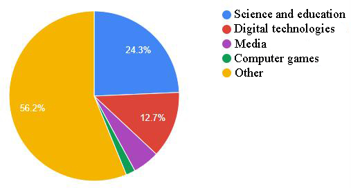
Figure 1 – Interests of university website visitors
As can be seen from Figure 1, among the interests of the user audience of university websites (Table 2), science and education, technology, news, and media can be distinguished. This means that users visit the university's website for information about educational programs, costs, and admission information.
Based on the research [7, 8], it is also possible to form applicants’ main goals, which create a significant part of the target audience of university websites. Among the main motives for applicants are interest in the profession, preparation for entrance exams, the possibility of studying at the expense of budgetary funds, and opportunities for future employment in their specialty. At the same time, the main criteria for choosing a university are highly qualified personnel, the possibility of internships, including foreign ones, a developed material base, and guarantees of employment upon graduation.
Table 2 shows that the primary visitors to university websites are users from Russia, Kazakhstan, and Ukraine. Nevertheless, although most visitors come from Russia (on average, 91.28%), there remains a need to organize successful cross-cultural communication with users from other countries.
Gert Hofstede's theory of cultural dimensions [9] allows for an international comparison of the target audience by measuring the cultural values of representatives of different countries. To compare the cultural values of users from Russia, Ukraine, and Kazakhstan, the Hofstede model based on six dimensions was applied [10]. For comparison, Russia, Kazakhstan, and Ukraine were selected as the users of these countries, which make up the main user audience of university websites from Table 2. The results of the comparison are shown in Figure 2.
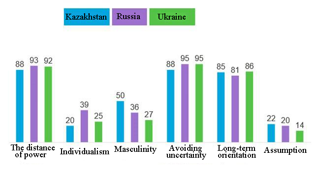
Figure 2 – Application of the Hofstede model for target audience analysis
As can be seen from Figure 2, the target audience of Russian university websites has approximately the same cultural values and behavior in general, which means choosing a single strategy in marketing and design, content placement, etc.
According to the high-power distance index, users expect to see an information resource that inspires confidence and respect for the organization. Therefore, it is necessary to place information on the pages of universities' websites that directly affects the image of an educational institution: data on leadership, quality of teaching, developments, and publications, famous graduates, reputable organizations with which cooperation is conducted, visits of officials, etc.
The average level of individualism among the target audience testifies to the awareness of oneself as "we," the desire to work in a group, to be part of something big and solid. Therefore, the information on the university's website, including graphic material, must be submitted from the point of view of the importance of common goals and interests, maintaining traditions, and emphasizing the importance of teamwork.
The average level of the masculinity index shows that the target audience is aimed at respecting cultural values and honoring relationships (respect for traditions, mentors, and elders).
The high level of uncertainty avoidance among the target audience suggests that visitors are somewhat conservative, so the design should be traditional, similar to other university sites, so as not to cause irritation.
The high level of long-term orientation reflects the target audience's desire to plan their future after graduation. It is important to post information about the future profession, the path of development, career growth, development in the scientific field, etc., supported by live examples.
The assumption index's low level indicates the target audience's commitment to strict social norms.
3 Basic requirements for the hardware and software platform of university websites: The hardware and software platform, according to GOST R 53622-2009 [11, clause 3.1], is a single complex of computer equipment and system programs.
Considering university websites' hardware and software platforms based on the purpose of such information systems, we can conclude that they are designed to store, transmit, and display information for their users.
Such a platform also implies the necessary automation of the processes of collecting and entering information and processing the received data for subsequent use and must meet the requirements imposed by legislation for such software [1–3, 12].
From the point of view of the functioning and structure requirements, a university website hardware and software platform is a server or a group of servers on the Internet that host databases, a content management system, and software responsible for presenting data to the end user.
Such sites' hardware and software platforms should be able to process requests from users of mobile and stationary devices, have a mobile version (adaptive design), and a version for the visually impaired. Also, the functionality for changing and supplementing sections of the site should be implemented.
To ensure the necessary level of information accessibility and ease of use, the university's website must comply with GOST R 52872-2019 [13], the WCAG 2.1 standard [14], and GOST R ISO 9241-20-2014 [15]. These standards largely duplicate and complement each other, regulating the requirements for perceptibility, manageability, safety, clarity, and reliability.
The HTML and JS code of university websites should be error-free. The page processing capabilities of various user applications, including assistive technologies, should be provided, and maximum compatibility with existing and developing user applications is also required. The site must use a secure HTTPS connection to ensure safe data transfer.
4 Approaches to interface design that minimize the limitations of users of university websites
4.1 Main limitations of features and their description
When visiting a university's website, users may encounter numerous restrictions, which are a serious obstacle to obtaining the necessary information.
Undoubtedly, the most vulnerable in this regard are users with disabilities: vision, hearing, and musculoskeletal problems. However, poorly designed sites can also create additional restrictions for other user groups.
The following main problems can be distinguished that prevent the use of the university's website to varying degrees [16, p. 11–13]:
1. cognitive impairment, i.e., difficulties in perceiving information: problems in finding and allocating useful data, concentration, identification of important objects, and decision-making;
2. motor disorders: difficulties when using input and control elements (for example, the site is not adapted to the use of the keyboard; you only need to use the mouse);
3. hearing impairment: the user does not hear the audio content, and the text version of this content is not provided;
4. visual impairment: the user does not see graphic materials, and their text description is not provided; the user has color blindness or reduced vision, and a special version for the visually impaired has not been developed; the posted content is not adapted to the use of special screen access programs that read the text;
5. technical limitations: the site interface is difficult or impossible to use on some devices (mobile devices, displays with a small screen), and the site works slowly (low performance of the software and hardware platform, instability under heavy loads, etc.).
Next, we will consider the most well-known and often used approaches to designing interfaces, which are proposed to be used in developing interfaces for university websites. These approaches make interfaces more convenient without overloading the user's short-term memory or causing premature fatigue.
4.2 Hick's Law: When developing approaches to reducing the cognitive load on the user, the results of research by William Hick [17], called "Hick's Law," are often taken into account.
According to this law, the time it takes a person to make a decision increases logarithmically with increasing choices. Hick's research was subsequently continued by other researchers [18, 19].
The primary meaning of Hick's law in relation to the design of web interfaces is that they should be as simple as possible: they do not need to be overloaded with data, but on the contrary, it is necessary to use the separation of complex elements into simpler ones, reducing choice; apply logical grouping, simplifying the process of selecting options and making navigation and use of the site user-friendly, reducing cognitive load and attention. For example, according to Hick's law, one menu with ten items is better than two menus with five in each.
4.3 Gestalt principles: Gestalt theory, which appeared in the 1890s as a response to the philosophy of atomism, was subsequently developed by German psychologists in the first half of the 20th century.
Currently, the basic idea of Gestaltism is widely used in interface design, according to which organized objects are perceived by the human brain faster as a whole than its components.
The following main gestalt principles can be distinguished [20–22]:
1. the principle of similarity: objects that have common visual characteristics (or look the same), such as shape, size, color, texture, meaning, or orientation, are perceived as connected groups or blocks; at the same time, color is a stronger property of grouping than shape and size, and among the forms, the simplest is chosen;
2. the principle of proximity or adjacency: objects that are closer to each other are visually perceived as a coherent group of objects;
3. the principle of continuity (continuation): points connected by straight or curved lines are seen most smoothly, i.e., the elements of a line or curve seem more connected to each other than elements arranged randomly, and the perception of visual information is continuous;
4. the principle of closeness: a group of elements is often perceived as one recognizable shape or figure, even if some of the information is missing;
5. the principle of symmetry: symmetrical elements are perceived as a single whole.
As follows from the above gestalt principles, the main idea of this theory is the grouping of objects based on visual similarity and location, based on the cognitive and psychological characteristics of the user. For example, the proximity principle is applied when designing navigation panels, cards, galleries, banners, lists, and the main text: connected elements are located as close as possible, and disconnected elements are located separately. The principle of symmetry is widely used to reduce cognitive load on content-loaded pages, lists, and navigation. Symmetry creates visual comfort and allows you to concentrate on the necessary information [23].
4.4 Miller's Law: In 1956, George Miller described a pattern [24] in which a person's short-term memory often cannot recall and repeat more elements (binary digits, letters of the alphabet, monosyllabic words). Miller associated this feature with the fact that a person paraphrases the information received by translating it into their inner verbal language.
The researcher also found that with the use of grouping, the possibilities of short-term memory increase.
This feature, called "Miller's Law," is often used to reduce the cognitive load on the user. At the same time, grouping, fragmentation, and presentation of data in a user-friendly template or format are used. For example, phone number formatting, credit card formatting, and text selection in frames are very often used.
4.5 Jacob's Law: Jacob Nielsen revealed a certain pattern of user behavior [25], which is called "Jacob's Law" and is widely used today. Nielsen noted that users spend most of their time on other sites, which means that they prefer other sites to work as well as all other sites they are already familiar with.
Visitors' user experience conditions this law and requires following generally accepted patterns in the design of interfaces to reduce the time it takes to get used to the interface and keep the user on the site's pages as long as possible.
In his main works [26, 27], Nielsen explores the usability and accessibility of interfaces, considering such indicators (heuristics) as the main indicators of a qualitatively designed interface:
1. Visibility of the system status: the system should inform users about what is happening through appropriate feedback within a reasonable period of time;
2. the coincidence between the system and the real world: the language should be understandable to the user (familiar phrases and concepts), the information is displayed in a natural and logical order;
3. user control and freedom: reversibility of user errors, their easy correction;
4. compliance with standards, i.e., platform and industry agreements;
5. error prevention through well-thought-out logic and conditions in the interface;
6. recognition, not recall: the cognitive load on the user should be minimized, and the information necessary to use the design (for example, field labels or menu items) should be visible or easily accessible if necessary;
7. Flexibility and efficiency of use: users should be able to configure and automate routine operations;
8. aesthetic and minimalistic design;
9. easy error diagnosis: error messages should be expressed in simple language (without error codes), accurately indicate the problem, and constructively offer a solution;
10. help and documentation: it is best if the system does not need additional explanations, but documentation explaining the functionality should be provided if necessary.
5 Checking university websites for compliance with accessibility standards
There are many different kinds of tools for assessing the accessibility of a website's web interface [28]. Let's use the "WAVE" tool [29] to check university websites from Table 1 for compliance with WCAG standards. The results of the check are shown in Table 3.
Table 3 – Checking university websites for compliance with WCAG standards
|
UNIVERSITY
|
Mistakes
|
Warnings
|
|
Total
|
There is no alt attribute
|
No
element
label
|
Low contrast of text and background
|
Link (button) without text
|
ARIA
|
|
BSTU "Voenmeh"
|
39
|
26
|
3
|
7
|
3
|
0
|
50
|
|
SPbGMTU
|
149
|
103
|
12
|
32
|
1
|
0
|
63
|
|
SPbPU
|
31
|
3
|
2
|
0
|
19
|
7
|
107
|
|
SPSU
|
63
|
57
|
1
|
0
|
5
|
0
|
94
|
|
MSU
|
56
|
2
|
1
|
0
|
53
|
0
|
229
|
|
HSE
|
211
|
7
|
2
|
169
|
32
|
0
|
61
|
|
FEFU
|
34
|
20
|
2
|
0
|
9
|
3
|
108
|
|
St. Petersburg State University
|
48
|
0
|
1
|
0
|
47
|
0
|
63
|
Table 3 shows the results of checking the main page and the version for the visually impaired (when multiple design themes were selected, the default theme was selected: white background, black text). Based on the data obtained, we can conclude that even the version for the visually impaired is poorly optimized for use by people with disabilities.
Thus, the high number of errors associated with the contrast of the text suggests that visitors with visual impairments may not read some text, even in a special version for the visually impaired. It is worth noting that the subsequent results of checking the usual versions of sites show an even greater number of accessibility errors related to the contrast of text and background.
Errors related to the absence of the "alt" attribute indicating that the contents of graphic materials will be inaccessible to screen readers or all users when the image itself is unavailable. Each image must have an "alt" attribute and provide alternative text.
Similarly, the absence of an associated text label (the "label" element) indicates that the function or purpose of this control will not be presented to users of screen readers.
The detected accessibility errors indicate that if a link or button on a website page does not contain text, then readers will not recognize their function or purpose and may mislead those who interact with the interface via the keyboard.
ARIA [30–32] (accessible rich internet applications) is a technological standard developed by the World Wide Web Consortium to enable the full use of the Internet by people with physical disabilities (impaired functioning of the visual organs and musculoskeletal system). It is a set of special attributes that can be added to any markup but is especially often used in HTML. The presence of violations of the ARIA standard indicates possible problems with the interaction of auxiliary devices with the site interface and the potential limitation of the capabilities of users with disabilities.
The detected warnings mainly relate to poor formatting and text presentation on the pages of the analyzed sites.
Analyzing university websites for compatibility with accessibility standards allows you to identify the most common errors and devise ways to eliminate them when designing their interfaces.
6 Basic requirements for the user interface of the University website
6.1 Accessibility requirements
As mentioned above, the interface of a university's website must comply with legislation and accessibility requirements, consider user sensory-motor and cognitive-psychological limitations, and meet users' needs.
Based on GOST R 52872-2019 [13], the WCAG 2.1 standard [14], and GOST R ISO 9241-20-2014 [15], we formulate below the basic requirements for the accessibility and ease of use of the University's website.
To ensure the perceptibility of information, a text version of all non-text content should be provided, considering the target audience's characteristics. So, for example, a full-featured version of the site for the visually impaired should be provided, with a large font, in black and white tones, if possible, hints or simplified terms, conditional signs, and voice should be provided.
It is necessary to ensure that all functionality can be controlled only using the keyboard and the mouse or other methods. Users should be able to adjust the browser window size without losing the site's functionality, i.e., the design should be adaptive. The functionality of controlling the playback of audio and video content posted on the site should be provided: volume control, shutdown, and pausing. The university's website should have a navigation menu, and the functionality of data search and determination of the current position on the site should be provided.
When placing audio and video content, it is necessary to avoid frequencies that can potentially cause visually induced seizures (no more than three flashes per second) and loudness that can harm hearing.
To better understand the information posted by users, it is necessary to make the entire text easy to read and understand: abbreviations should be deciphered; rare words and phrases should be explained or should not be used. It is necessary to ensure the predictability of the display of information and the behavior of the site as a whole: shifting the focus to another component should not cause feelings of loss of orientation on the page and changes in its meaning; the user interface should change only at the user's request; uniformity in navigation and component names is required.
In addition to the above, special functionality should be provided to prevent or correct user errors when entering: detecting water errors in automatic mode, hints and error messages, and instructions explaining the rules for working with the site.
The user should have the "right to make an error": input fields should be checked both on the client and on the server side, and a mechanism for changing the entered data should be implemented when filling out step-by-step forms, it is necessary to save each step so that the user does not lose the entered data by accidentally closing the tab with the site.
6.2 Requirements for the placement of content and structural elements. The main goals and needs of applicants were identified from the analysis of university websites' target audience. Accordingly, when designing the main page, information blocks with information about admission (links to bachelor's, master's, postgraduate studies, etc.), the admission process, cooperation with large companies and employment opportunities in them, foreign internships and student exchange, and teacher qualifications are required.
This information should be clearly visible and highlighted, and links should lead to pages with well-structured information relevant to the title.
When analyzing university websites (Table 1), it was noticed that many of them rely on showing university news. Information about educational programs, which is the main need of visitors, is presented on secondary pages and is not always easy to find. This fact reduces visitor conversion, at least when recruiting for paid programs [33].
Following Jacob's law, the interface and structure of the university's website should be similar to other sites in this area. The analysis of university websites (Table 1) concluded that the main menu should be located in the header; in the upper right corner, there should be a button to enable the version for the visually impaired and a language selection button. Also, you need to place a search form in the site header (it can be enabled by the corresponding button). Such placement of controls will be most familiar to the user audience and will reduce the time spent getting used to the interface.
The information on the main page should be presented in a single-column template, divided into information blocks. A slideshow or video can be integrated (such blocks on the sites considered are usually immediately after the header). The main menu should be duplicated in the site's footer.
6.3 Requirements for compliance with the color scheme and text submission: When creating content and choosing the site's color schemes, Hofstede's analysis of the target audience and the basic principles of color selection should be considered.
Blue or blue tones are preferred as the main colors, as they symbolize trust, loyalty, wisdom, intelligence, faith, and truth. Such colors produce a calming effect associated with technology and modernity [34, 35].
The page's main color should give the entire page its tone. The secondary color should complement the main color and be close to the main one. The highlighting color used to highlight certain areas on pages should be more contrasting than the primary and secondary and should be used in moderation [36].
To reduce premature fatigue of the user when reading the posted information, preference should be given to dark blue or black for the main font. A line of text should contain 50-70 characters. To keep the view on the text column of the page and eliminate involuntary translations of the view to neighboring columns, the size of the fields must be at least 10% of the width of the text line. Inter-characters and line spacing that are too small are uncomfortable for the user and should be avoided when developing a website design [37].
When designing a university website, it is also necessary to follow the other principles discussed above (Hick and Miller's laws, gestalt principles, Jacob's heuristics): apply separation of complex elements into simpler ones, simplifying the selection; use data fragmentation and formatting; handle user errors, etc.
Also, it is worth paying special attention to the development of a version for the visually impaired since, as the study conducted within the framework of this work shows, errors in the availability of content in such modes were found on all analyzed university sites (Table 1), which makes it difficult or even impossible for the corresponding group of users to use these sites.
Conclusion
In this paper, it was shown that a well-designed interface of a University's website should comply with legislation and accessibility requirements, take into account sensory-motor and cognitive-psychological limitations of users' capabilities, and meet their needs.
The analysis of eight university websites revealed the main interests, geographical features, and behavior of the user audience, and the subsequent verification of compliance with the accessibility requirements of versions for visually impaired sites revealed numerous violations, which once again confirms the relevance of the topic of this study. Also, it can be concluded that the methods of organizing content on the analyzed sites do not meet the requirements of the main user audience or applicants, which may slow down the return of capital invested in the development.
The paper describes the main possible limitations of users of the university's website: cognitive impairments (difficulties in perceiving information), motor impairments (the site is not adapted to the use of controls and input), hearing and visual impairments (lack of text accompaniment of media files), various technical limitations (low productivity, inability to use on mobile devices).
The paper concludes that to adapt a University's website to the limitations of users' capabilities, it is necessary to follow basic practices such as Hick's Law, Gestalt Principles, Miller's Law, Jacob's Law, and Heuristics. Based on these practices, the basic requirements for the user interface of the University's website are formed.
Библиография
1. Мельникова Р. В. Выбор оптимальных характеристик при проектировании программного интерфейса // ВЕЖПТ. 2009. №2 (41). URL: https://cyberleninka.ru/article/n/vybor-optimalnyh-harakteristik-pri-proektirovanii-programmnogo-interfeysa (дата обращения: 04.02.2022).
2. Сугак Д. Б. Роль веб-сайта в научно-образовательной деятельности вуза // Вестник СПбГИК. 2012. №3. URL: https://cyberleninka.ru/article/n/rol-veb-sayta-v-nauchno-obrazovatelnoy-deyatelnosti-vuza (дата обращения: 04.02.2022).
3. Accessible Rich Internet Applications (WAI-ARIA) 1.1 [Электронный ресурс]. URL: https://www.w3.org/TR/wai-aria/ (дата обращения: 04.02.2022).
4. Fogli D., Provenza L.P., Bernareggi C. (2013). A universal design resource for rich Internet applications based on design patterns // Universal Access in the Information Society. 2014. URL: http://dx.doi.org/10.1007/s10209-013-0291-6 (дата обращения: 04.02.2022).
5. Stelea G. A., Fernoaga V., Gavrila C., Popescu V., Murroni M. Mobile accessible rich internet web application enhanced with AMP publishing technology // Review of the Air Force Academy. 2019. URL: https://doi.org/10.19062/1842-9238.2019.17.1.9 (дата обращения: 04.02.2022).
6. WAVE Web Accessibility Evaluation Tool [Электронный ресурс]. URL: https://wave.webaim.org (дата обращения: 04.02.2022).
7. Nielsen J. Designing web usability / New Riders Pub. 1999. 300 p.
8. Vigo M., Brown J., Conway V. L. Benchmarking web accessibility evaluation tools: Measuring the harm of sole reliance on automated tests // W4A 2013-International Cross-Disciplinary Conference on Web Accessibility. 2013. URL: https://doi.org/10.1145/2461121.2461124 (дата обращения: 04.02.2022).
9. Nielsen J. Usability engineering / Academic Press. 1993. 358 p.
10. Nielsen J. Jakob's law of internet user experience [Электронный ресурс]. 2000. URL: https://www.nngroup.com/videos/jakobs-law-internet-ux/ (дата обращения: 04.02.2022).
11. Gkogka E. Gestalt principles in UI design [Электронный ресурс]. 2018. URL: https://medium.muz.li/gestalt-principles-in-ui-design-6b75a41e9965 (дата обращения: 04.02.2022).
12. Miller G. A. The magical number seven plus or minus two: some limits on our capacity for processing information // Psychological review. 1956. URL: https://doi.org/10.1037/h0043158 (дата обращения: 04.02.2022).
13. Moore P., Fitz C. Gestalt theory and instructional design // Journal of Technical Writing and Communication. 1993. URL: https://doi.org/10.2190/G748-BY68-L83T-X02J (дата обращения: 04.02.2022).
14. Bakaev M., Razumnikova O. What makes a UI simple? Difficulty and complexity in tasks engaging visual-spatial working memory // Future Internet. 2021. URL: http://dx.doi.org/10.3390/fi13010021 (дата обращения: 04.02.2022).
15. Costa C. J., Costa P., Aparicio M. Principles for creating web sites: A design perspective // ICEIS. 2004. URL: https://doi.org/10.5220/0002613004840488 (дата обращения: 04.02.2022).
16. Landauer T. K., Nachbar D. W. Selection from alphabetic and numeric menu trees using a touch screen: breadth, depth, and width // Proceedings of the SIGCHI Conference on Human Factors in Computing Systems (CHI ’85). 1985. URL: http://dx.doi.org/10.1145/317456.317470 (дата обращения: 04.02.2022).
17. Hick W. E. On the rate of gain of information // Quarterly Journal of Experimental Psychology. 1952. URL: http://dx.doi.org/10.1080/17470215208416600 (дата обращения: 04.02.2022).
18. Hyman R. Stimulus information as a determinant of reaction time // Journal of experimental psychology. 1953. URL: http://dx.doi.org/10.1037/h0056940 (дата обращения: 04.02.2022).
19. Косова Е. А. Веб-доступность в электронном обучении: По дисциплине «Технологии высшего образования» для обучающихся направлений подготовки 01.04.02 «Прикладная математика и информатика», 01.04.04 «Прикладная математика» / Издательство Типография «Ариал». 2020. – 88 с.
20. ГОСТ Р ИСО 9241-20-2014. Эргономика взаимодействия человек-система. Часть 20. Руководство по доступности оборудования и услуг в области информационно-коммуникационных технологий.
21. Kirkpatrick A., Connor J. О., Campbell A., Cooper M. Web content accessibility guidelines (WCAG) 2.1 [Электронный ресурс]. URL: https://www.w3.org/TR/WCAG21/ (дата обращения: 04.02.2022).
22. Федеральный закон "О персональных данных" от 27.07.2006 N 152-ФЗ (с изменениями на 2 июля 2021 года).
23. ГОСТ Р 52872–2019. Национальный стандарт Российской Федерации. Интернет-ресурсы и другая информация, представленная в электронно-цифровой форме. Приложения для стационарных и мобильных устройств, иные пользовательские интерфейсы. Требования доступности для людей с инвалидностью и других лиц с ограничениями жизнедеятельности.
24. Country Comparison – Hofstede Insights [Электронный ресурс]. URL: https://www.hofstede-insights.com/country-comparison/kazakhstan,russia,ukraine/ (дата обращения: 04.02.2022).
25. ГОСТ Р 53622–2009. Национальный стандарт Российской Федерации. Информационные технологии. Информационно-вычислительные системы. Стадии и этапы жизненного цикла, виды и комплектность документов.
26. Hofstede G. Dimensionalizing Cultures: The Hofstede model in context // Online Readings in Psychology and Culture. 2011. URL: https://doi.org/10.9707/2307-0919.1014 (дата обращения: 04.02.2022).
27. Конасова Н. Ю. Портрет абитуриента / Высшая школа экономики. 2016. URL: https://spb.hse.ru/data/2017/10/10/1159396033/Исследование Абитуриент 2016.pdf (дата обращения: 04.02.2022).
28. Конасова Н. Ю. От человеческого потенциала к человеческому капиталу: качественные результаты образования и возможности их изменения в программах взаимодействия школы и вуза // Ped.Rev.. 2017. №3 (17). URL: https://doi.org/10.23951/2307-6127-2017-3-134-143 (дата обращения: 04.02.2022).
29. Website traffic – Check and analyze any website [Электронный ресурс]. URL: https://www.similarweb.com (дата обращения: 04.02.2022).
30. Гохберг Л. М., Озерова О. К., Саутина Е. В. Образование в цифрах: 2021: краткий статистический сборник / Нац. исслед. ун-т «Высшая школа экономики». – М.: НИУ ВШЭ. 2021. – 132 с. URL: https://doi.org/10.17323/978-5-7598-2384-1 (дата обращения: 04.02.2022).
31. Бондаренко Н. В., Гохберг Л. М., Кузнецова В. И. Индикаторы образования: 2021: статистический сборник / Нац. исслед. ун-т «Высшая школа экономики». – М.. НИУ ВШЭ. 2021. – 508 с. URL: https://doi.org/10.17323/978-5-7598-2356-8 (дата обращения: 04.02.2022).
32. Федеральный закон "О социальной защите инвалидов в Российской Федерации" от 24.11.1995 N 181-ФЗ (с изменениями на 11 июня 2021 года).
33. Федеральный закон "Об образовании в Российской Федерации" от 29.12.2012 N 273-ФЗ (с изменениями на 30 декабря 2021 года).
34. Приказ Федеральной службы по надзору в сфере образования и науки от 14.08.2020 № 831 "Об утверждении Требований к структуре официального сайта образовательной организации в информационно-телекоммуникационной сети "Интернет" и формату представления информации".
35. Калугина Ю. В., Кондакова А. А., Михайлов А. С., Стрельникова С. В. Роль цвета в веб-дизайне // Решетневские чтения. 2018. URL: https://cyberleninka.ru/article/n/rol-tsveta-v-veb-dizayne (дата обращения: 04.02.2022).
36. Гавричкова Е. С., Петрова О. А. Влияние цвета на восприятие человека // Актуальные проблемы авиации и космонавтики. 2012. №8. URL: https://cyberleninka.ru/article/n/vliyanie-tsveta-na-vospriyatie-cheloveka (дата обращения: 04.02.2022).
37. Якутова О. М., Петрова О. А. Шрифт как элемент дизайна веб-сайта // Актуальные проблемы авиации и космонавтики. 2013. №9. URL: https://cyberleninka.ru/article/n/shrift-kak-element-dizayna-veb-sayta (дата обращения: 04.02.2022).
References
1. Mel'nikova R. V. Vybor optimal'nykh kharakteristik pri proektirovanii programmnogo interfeisa // VEZhPT. 2009. №2 (41). URL: https://cyberleninka.ru/article/n/vybor-optimalnyh-harakteristik-pri-proektirovanii-programmnogo-interfeysa (data obrashcheniya: 04.02.2022).
2. Sugak D. B. Rol' veb-saita v nauchno-obrazovatel'noi deyatel'nosti vuza // Vestnik SPbGIK. 2012. №3. URL: https://cyberleninka.ru/article/n/rol-veb-sayta-v-nauchno-obrazovatelnoy-deyatelnosti-vuza (data obrashcheniya: 04.02.2022).
3. Accessible Rich Internet Applications (WAI-ARIA) 1.1 [Elektronnyi resurs]. URL: https://www.w3.org/TR/wai-aria/ (data obrashcheniya: 04.02.2022).
4. Fogli D., Provenza L.P., Bernareggi C. (2013). A universal design resource for rich Internet applications based on design patterns // Universal Access in the Information Society. 2014. URL: http://dx.doi.org/10.1007/s10209-013-0291-6 (data obrashcheniya: 04.02.2022).
5. Stelea G. A., Fernoaga V., Gavrila C., Popescu V., Murroni M. Mobile accessible rich internet web application enhanced with AMP publishing technology // Review of the Air Force Academy. 2019. URL: https://doi.org/10.19062/1842-9238.2019.17.1.9 (data obrashcheniya: 04.02.2022).
6. WAVE Web Accessibility Evaluation Tool [Elektronnyi resurs]. URL: https://wave.webaim.org (data obrashcheniya: 04.02.2022).
7. Nielsen J. Designing web usability / New Riders Pub. 1999. 300 p.
8. Vigo M., Brown J., Conway V. L. Benchmarking web accessibility evaluation tools: Measuring the harm of sole reliance on automated tests // W4A 2013-International Cross-Disciplinary Conference on Web Accessibility. 2013. URL: https://doi.org/10.1145/2461121.2461124 (data obrashcheniya: 04.02.2022).
9. Nielsen J. Usability engineering / Academic Press. 1993. 358 p.
10. Nielsen J. Jakob's law of internet user experience [Elektronnyi resurs]. 2000. URL: https://www.nngroup.com/videos/jakobs-law-internet-ux/ (data obrashcheniya: 04.02.2022).
11. Gkogka E. Gestalt principles in UI design [Elektronnyi resurs]. 2018. URL: https://medium.muz.li/gestalt-principles-in-ui-design-6b75a41e9965 (data obrashcheniya: 04.02.2022).
12. Miller G. A. The magical number seven plus or minus two: some limits on our capacity for processing information // Psychological review. 1956. URL: https://doi.org/10.1037/h0043158 (data obrashcheniya: 04.02.2022).
13. Moore P., Fitz C. Gestalt theory and instructional design // Journal of Technical Writing and Communication. 1993. URL: https://doi.org/10.2190/G748-BY68-L83T-X02J (data obrashcheniya: 04.02.2022).
14. Bakaev M., Razumnikova O. What makes a UI simple? Difficulty and complexity in tasks engaging visual-spatial working memory // Future Internet. 2021. URL: http://dx.doi.org/10.3390/fi13010021 (data obrashcheniya: 04.02.2022).
15. Costa C. J., Costa P., Aparicio M. Principles for creating web sites: A design perspective // ICEIS. 2004. URL: https://doi.org/10.5220/0002613004840488 (data obrashcheniya: 04.02.2022).
16. Landauer T. K., Nachbar D. W. Selection from alphabetic and numeric menu trees using a touch screen: breadth, depth, and width // Proceedings of the SIGCHI Conference on Human Factors in Computing Systems (CHI ’85). 1985. URL: http://dx.doi.org/10.1145/317456.317470 (data obrashcheniya: 04.02.2022).
17. Hick W. E. On the rate of gain of information // Quarterly Journal of Experimental Psychology. 1952. URL: http://dx.doi.org/10.1080/17470215208416600 (data obrashcheniya: 04.02.2022).
18. Hyman R. Stimulus information as a determinant of reaction time // Journal of experimental psychology. 1953. URL: http://dx.doi.org/10.1037/h0056940 (data obrashcheniya: 04.02.2022).
19. Kosova E. A. Veb-dostupnost' v elektronnom obuchenii: Po distsipline «Tekhnologii vysshego obrazovaniya» dlya obuchayushchikhsya napravlenii podgotovki 01.04.02 «Prikladnaya matematika i informatika», 01.04.04 «Prikladnaya matematika» / Izdatel'stvo Tipografiya «Arial». 2020. – 88 s.
20. GOST R ISO 9241-20-2014. Ergonomika vzaimodeistviya chelovek-sistema. Chast' 20. Rukovodstvo po dostupnosti oborudovaniya i uslug v oblasti informatsionno-kommunikatsionnykh tekhnologii.
21. Kirkpatrick A., Connor J. O., Campbell A., Cooper M. Web content accessibility guidelines (WCAG) 2.1 [Elektronnyi resurs]. URL: https://www.w3.org/TR/WCAG21/ (data obrashcheniya: 04.02.2022).
22. Federal'nyi zakon "O personal'nykh dannykh" ot 27.07.2006 N 152-FZ (s izmeneniyami na 2 iyulya 2021 goda).
23. GOST R 52872–2019. Natsional'nyi standart Rossiiskoi Federatsii. Internet-resursy i drugaya informatsiya, predstavlennaya v elektronno-tsifrovoi forme. Prilozheniya dlya statsionarnykh i mobil'nykh ustroistv, inye pol'zovatel'skie interfeisy. Trebovaniya dostupnosti dlya lyudei s invalidnost'yu i drugikh lits s ogranicheniyami zhiznedeyatel'nosti.
24. Country Comparison – Hofstede Insights [Elektronnyi resurs]. URL: https://www.hofstede-insights.com/country-comparison/kazakhstan,russia,ukraine/ (data obrashcheniya: 04.02.2022).
25. GOST R 53622–2009. Natsional'nyi standart Rossiiskoi Federatsii. Informatsionnye tekhnologii. Informatsionno-vychislitel'nye sistemy. Stadii i etapy zhiznennogo tsikla, vidy i komplektnost' dokumentov.
26. Hofstede G. Dimensionalizing Cultures: The Hofstede model in context // Online Readings in Psychology and Culture. 2011. URL: https://doi.org/10.9707/2307-0919.1014 (data obrashcheniya: 04.02.2022).
27. Konasova N. Yu. Portret abiturienta / Vysshaya shkola ekonomiki. 2016. URL: https://spb.hse.ru/data/2017/10/10/1159396033/Issledovanie Abiturient 2016.pdf (data obrashcheniya: 04.02.2022).
28. Konasova N. Yu. Ot chelovecheskogo potentsiala k chelovecheskomu kapitalu: kachestvennye rezul'taty obrazovaniya i vozmozhnosti ikh izmeneniya v programmakh vzaimodeistviya shkoly i vuza // Ped.Rev.. 2017. №3 (17). URL: https://doi.org/10.23951/2307-6127-2017-3-134-143 (data obrashcheniya: 04.02.2022).
29. Website traffic – Check and analyze any website [Elektronnyi resurs]. URL: https://www.similarweb.com (data obrashcheniya: 04.02.2022).
30. Gokhberg L. M., Ozerova O. K., Sautina E. V. Obrazovanie v tsifrakh: 2021: kratkii statisticheskii sbornik / Nats. issled. un-t «Vysshaya shkola ekonomiki». – M.: NIU VShE. 2021. – 132 s. URL: https://doi.org/10.17323/978-5-7598-2384-1 (data obrashcheniya: 04.02.2022).
31. Bondarenko N. V., Gokhberg L. M., Kuznetsova V. I. Indikatory obrazovaniya: 2021: statisticheskii sbornik / Nats. issled. un-t «Vysshaya shkola ekonomiki». – M.. NIU VShE. 2021. – 508 s. URL: https://doi.org/10.17323/978-5-7598-2356-8 (data obrashcheniya: 04.02.2022).
32. Federal'nyi zakon "O sotsial'noi zashchite invalidov v Rossiiskoi Federatsii" ot 24.11.1995 N 181-FZ (s izmeneniyami na 11 iyunya 2021 goda).
33. Federal'nyi zakon "Ob obrazovanii v Rossiiskoi Federatsii" ot 29.12.2012 N 273-FZ (s izmeneniyami na 30 dekabrya 2021 goda).
34. Prikaz Federal'noi sluzhby po nadzoru v sfere obrazovaniya i nauki ot 14.08.2020 № 831 "Ob utverzhdenii Trebovanii k strukture ofitsial'nogo saita obrazovatel'noi organizatsii v informatsionno-telekommunikatsionnoi seti "Internet" i formatu predstavleniya informatsii".
35. Kalugina Yu. V., Kondakova A. A., Mikhailov A. S., Strel'nikova S. V. Rol' tsveta v veb-dizaine // Reshetnevskie chteniya. 2018. URL: https://cyberleninka.ru/article/n/rol-tsveta-v-veb-dizayne (data obrashcheniya: 04.02.2022).
36. Gavrichkova E. S., Petrova O. A. Vliyanie tsveta na vospriyatie cheloveka // Aktual'nye problemy aviatsii i kosmonavtiki. 2012. №8. URL: https://cyberleninka.ru/article/n/vliyanie-tsveta-na-vospriyatie-cheloveka (data obrashcheniya: 04.02.2022).
37. Yakutova O. M., Petrova O. A. Shrift kak element dizaina veb-saita // Aktual'nye problemy aviatsii i kosmonavtiki. 2013. №9. URL: https://cyberleninka.ru/article/n/shrift-kak-element-dizayna-veb-sayta (data obrashcheniya: 04.02.2022).
Результаты процедуры рецензирования статьи
В связи с политикой двойного слепого рецензирования личность рецензента не раскрывается.
Со списком рецензентов издательства можно ознакомиться здесь.
В рецензируемой статье рассматриваются вопросы формирования требований к интерфейсу сайтов высших учебных заведений, исходя из стандартов доступности и удобства использования.
Актуальность темы исследования обусловлена тем, что размещенная на сайтах вузов информация не всегда удовлетворяет потребностям их посетителей, а при проектировании пользовательского интерфейса массового программного обеспечения важно принимать во внимание ограничения возможностей пользовательской аудитории, включая сенсорно-моторные и когнитивно-психологические ограничения. Авторы статьи исходят из того, что учет этих особенностей позволит спроектировать удобный пользовательский интерфейс сайта.
Научная новизна представленного исследования, по мнению рецензента, заключается в сформулированных автором статьи требованиях к пользовательскому интерфейсу сайтов высших учебных заведений. Систематизация этих требований проведена на основе проведенного анализа веб-сайтов восьми университетов Российской Федерации.
В тексте статьи выделены: введение, шесть разделов основной части работы, заключение, библиография.
В первом разделе рассмотрено целевое назначение сайтов, отмечено, что в вузах они предназначаются для использования широкой пользовательской аудиторией, в том числе и людьми с ограничениями по здоровью, которым, в соответствии с российским законодательством должен быть обеспечен беспрепятственный доступ к информации. Описание целевой аудитории отражено во втором разделе, где отражен общий портрет обучающихся, сформированный на основе статистических данных и обобщения литературных источников. Эта часть работы иллюстрирована двумя таблицами и двумя рисунками. Далее в третьем разделе автором изложены основные требования к аппаратно-программной платформе сайтов вузов. Текст четвертого раздела разбит на пять параграфов: Основные ограничения возможностей и их описание, Закон Хика, Гештальт-принципы, Закон Миллера, Закон Джейкоба, в каждом из которых отражены сформулированные в разное время закономерности пользовательского поведения, которые автор рассматривает применительно к посетителям сайтов вузов. В пятом разделе проведена проверка сайтов на соответствие международным стандартам обеспечения доступности веб-контента (WCAG), обнаружены предупреждения, в основном, относящиеся к плохому форматированию и подаче текста на страницах проанализированных сайтов вузов. Далее, в шестом разделе сформулированы основные требования к пользовательскому интерфейсу сайта вуза: Требования доступности, Требования по размещению контента и структурных элементов,
Требования по соблюдению цветовой схемы и подачи текста. В Заключении статьи сделан вывод о том, что для адаптации сайта ВУЗа к ограничениям возможностей пользователей необходимо следовать основным практикам, таким как: Закон Хика, Гештальт-принципы, Закон Миллера, Закон и эвристики Джейкоба.
Библиография статьи включает 37 источников – современные публикации отечественных и зарубежных ученых в периодических научных журналах, законодательные акты и стандарты, а также интернет-ресурсы. На приведенные в списке литературы источники в тексте имеются адресные ссылки, что свидетельствует о наличии в публикации апелляции к оппонентам.
В качестве замечание следует отметить, что название четвертого раздела «Ограничения возможностей пользователя сайта ВУЗа и пути их устранения» требует редактирования, поскольку может быть истолкован читателями неоднозначно – следует чётче отразить в формулировке, что автор ратует за устранение именно ограничений возможностей.
Рецензируемый материал подготовлен на актуальную тему, отражает результаты проведенного автором исследования и может быть опубликован после устранения отмеченного недочета.
Ссылка на эту статью
Просто выделите и скопируйте ссылку на эту статью в буфер обмена. Вы можете также
попробовать найти похожие
статьи
|
|